IKEA -
exploring a peer-to-peer solution for deliveries

The problem — Almost everyone has some kind of experience with shopping at IKEA, either on their website or in the physical store. And almost everyone has experience from trying to get their products home from IKEA, it’s not always an easy task. And if you don’t have a car or can’t afford their own delivery service there are very few other options to have a successful .

Why is this case here? — The main idea with this project was to see how a mix of business strategy and UX design could help build an innovative digital solution but also to see how to handle possible obstacles that occurs with a innovation driven project in the start-up phase.

What did I learn? — I learned to start a project with nothing more that a business canvas model and based only on assumptions watch it grow into a embryo of a innovative peer-to-peer service ready for further development.

Goals
Deliver a digital innovative solution by the end of the course.
Go through every step of the Lean UX process.

My role — Since this was a student project my role was to undertake several different assignments during the project. I worked on every part in the design process together with my classmate with who I ran the project with.

Timeframe — 4 weeks


MY PROCESS

Design thinking and Lean UX

By working with the Design thinking process merged with Lean UX we were able to locate ares of possibilities and create solutions and try them out in quite quick manner. Together with the learnings we got from “Design Sprint” we tried to create solutions at a very low fidelity and then validated. This meant we could explore, and dismiss, solutions at a quick rate before we found one that would work.


IDENTIFYING THE NEED

Mapping out the business

We used the Business Model Canvas to document the current business model for IKEA. Going through the nine building blocks we could get a comprehensive picture of IKEA’s business model.


IDENTIFYING THE NEED

Target group

Although it’s tempting to put in “everyone” when talking about IKEA’s customers we skipped the temptation and put a bit more effort in defining what we thought were the most important customers for IKEA.


Families (price sensitive)

Smaller companies

Students


When matching the value proposition with the target groups we saw that there might be a mismatch: Students, in Sweden, generally don’t have a car. Do the proposition really apply to them as well? How easy is it to transport IKEA furniture without a car? These questions apply to the rest of the groups as well: how is the experience, shopping at IKEA, effected by not having a car?

IDENTIFYING THE NEED

Delivery alternatives

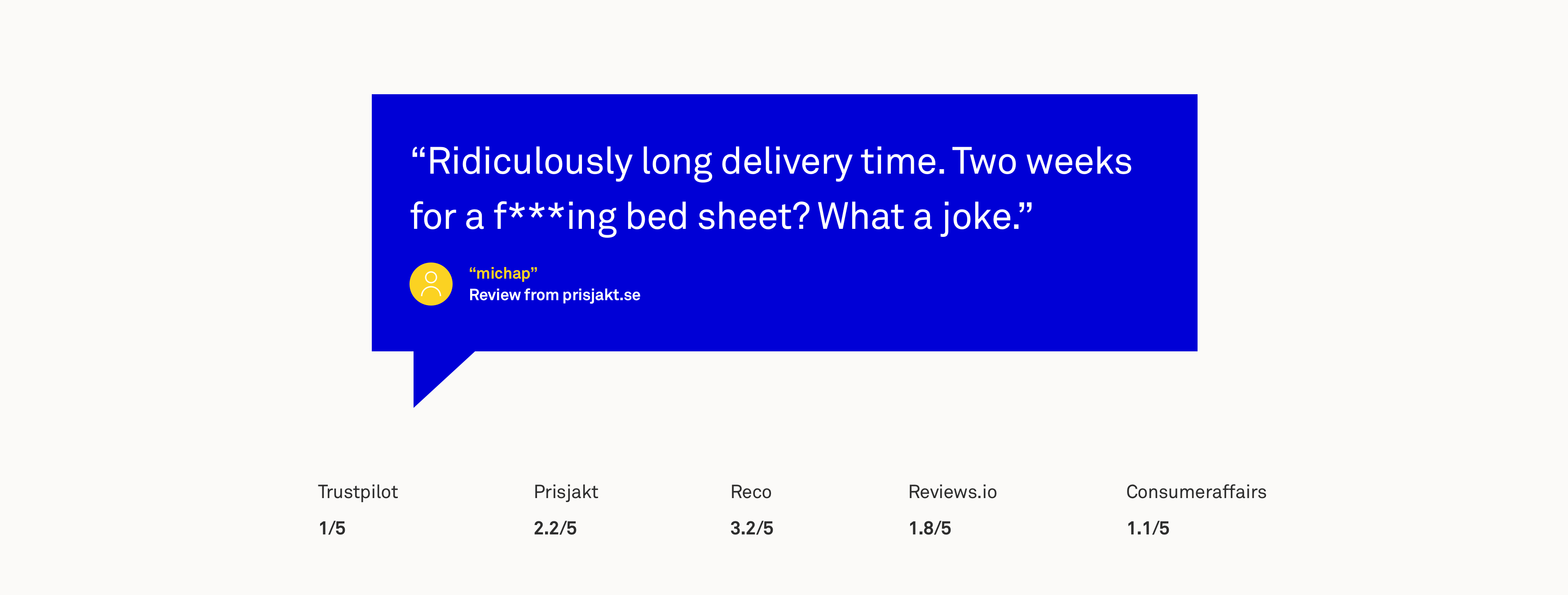
Since car isn’t the only option to get your products home from IKEA we took to desk research to see how people talked about IKEA’s own delivery service. Right away we saw that both reviews and the ratings wasn’t very positive. When comparing the price for a delivery we could see that IKEA was pretty expensive compared to similar businesses and their delivery services.


IDENTIFYING THE NEED

Primary target group

Since this was a small project with limited time we decided to limit our user research to one target group: students. Our assumption was that they don’t have access to a car in the same range as the other groups, they are sensitive to the relative high delivery prices, also something not specific for students. But the main difference was that we also were students and that we easily could find people to participate in our research.

IDENTIFYING THE NEED

Problem hypothesis

Based on our preparatory work we created a problem hypothesis that would define the rest of our project:


“Students with no direct access to a car have problems getting their purchased products home from IKEA’s stores and they avoid home deliveries because of the high cost.”

DEFINE

Provisional persona

We created a simple student persona to create shared vision of who we were helping.


IDEATION

Brainstorming

We started brainstorming around how we could help people without car on a limited budget to get their products home. Some ideas were more serious than the others but still important to get up on the whiteboard.


IDEATION

Solution idea

Based on what we knew and what we assumed we came up with an idea for a peer-to-peer solution for deliveries that would benefit both the receiver and the person that delivers. Our idea was: “A service that lets customers with car help customers without a car with home deliveries from IKEA stores”.


DEFINE

Provisional persona 2 – Driver

Since this idea was a two side market we had to create one more persona that would be equally important to the service: the driver.


RESEARCH

Validating the idea

When we had our innovative idea on how to solve the deliveries for those without a car we set out to see if this actually was a problem. Up till now all of our work was hypothetical and we had to validate, not only the the idea but the personas as well. First of we headed to an IKEA store just outside Gothenburg. We had been in contact with their CX Manager and the Marketing Manager before and we got a lot of help from them. We also got to interview them about their current delivery service and how they see the primary target group that we choose to focus on, this was very useful for the project and we were treated in the best way possible!


Supporting material

Before heading out to get some answers we created a box that would represent an order from IKEA. The box was pretty large and heavy because we wanted our potential users to get an idea of what the service would be like to carry out. We also created a first prototype of the service, a map with IKEA in one corner and a house icon representing the users home plus we made moveable pieces so we could test the scenario in different ways. This way we could really get the potential drivers to think deep about the task and evaluate their thinking process.


Collecting data


Drivers

We carried out 15 contextual interviews inside of IKEA. It was important for us that is was on the IKEA premises since we wanted to get true answers from the potential drivers about carrying out the task, it might have been too easy be positive about the service when not in the right context. The box we brought along also let us do a service safari by going back from IKEA going by bus to see if this was an option, it really wasn’t.


Stakeholder interviews

When we interviewed the CX Manager and the Marketing Manager we got a deeper understanding and some clarifications around a few topics we were interested in, these topics were: “The IKEA experience”, the current delivery system, visions and future prognosis for IKEA, attitude towards reward and point-systems, cooperation (or the lack of) with public transports. A discussion took place after each interview whether IKEA should be helping customers staying at home getting their purchases delivered to them or not. The Marketing Manager was quite sceptical to this idea since she firmly believed in getting people into the physical store since that generated more revenue from unplanned purchases. The CX Manager had a more user centric view and said that getting people to experience IKEA isn’t only about getting them to the store and that “we can never force people to something that they don’t want to do”.


Students

We carried out 12 interviews on campus since we decided it wasn’t that important to be in the right context. The important thing was to see how the students felt about having a non official delivery to their home.


DEFINE

Evaluate the findings

When we were finished with gathering the data we started analysing to see if we could answer our own questions about the idea:


Did we focus on the right target group?

Do our assumed problems exist?

→ If so, are these the right problems to focus on?

Do people want a service like this?


Personas

We also created new personas and developed our hypothetical ones based on our interviews. We thought it would be enough with one persona for the student and two for the drivers since the drivers responded very different to what would motivate them to take part in our new delivery service.


User journey

We mapped out the users steps to see how we could make the journey easier and what issues our new service would fix and where to implement it.

Insights

Based on all the interviews we made with our potential future users we listed some insights that would help further develop the idea.


Students

Wants to be able to inform the driver in advance of special circumstances when it comes to parking spaces etc.

→ Wants a way to communicate with the driver if needed.

Wants to know the conditions before using he service.

Wants to be able to follow the delivery status and get a notification when it’s due.


Drivers

If the delivery is on the way home the potential drivers are way more willing to perform the task.

Wants to be able to communicate personally with the receiver to avoid misunderstandings.

Many drivers want to minimize the interaction with the receiver if possible.

The drivers want full information about the assignment before accepting, there should be no surprises.

The view on what would be an ok reward differs from driver to driver.

They want to know and be sure of someone’s having their backs in case of troubles.

BUILD

Mapping out the interactions

When we had refined our idea based on our insights we created a map over the interactions with the service. We saw that implementing the function for the students would be enough for the web shop only and communicating via SMS. But the drivers would need an app because of additional functionality such as maps, scanning and profile handling.


BUILD

Prototyping

When we knew what to build and what key functions the service needed we started sketching low fidelity wireframes. This way we could iterate through the design options quickly and together create a common vision of the service. From there we created a mid-fi prototype and made it clickable in Invision for usability testing.


Usability testing

The test was basically just to see if people understood the app and its functionality and not the service itself. We created a test with some inspiration from “Service Staging”, creating a scene with theatrical ingredients. The scene took place in “IKEA” and the user started the test by getting informed of this new service and was asked to “download” the app “Överlämna”. And then they was asked to go to the desk and receive a package and from there they were asked to think out lout while they navigated through the app.


THE RESULT

Wireframes of the solution

A couple of iterations later, based on usability test results, we had a version that would be ready for the next step in testing our idea. Although we would never get there since the project time ran out but the plan was to test the service to its full extent including a delivery a by car.


Tutorial

We created a tutorial that we thought would explain the service in four screens and when we implemented it many general questions about the service disappeared in the tests.


Startscreen

The home screen consists of the map that directly shows your location centered and that shows the fastest way home from where you are. If you choose a package (delivery address) on the map, the fastest route is recalculated at the same time as a product card appears at the bottom with the nature of the package but also information about what rewards you can expect. This function of constantly recalculating the route so that you can set it against what it takes to get home means that the drivers always have a variable to set against the reward. We saw this as a necessary feature because many people we interviewed pointed out the particular distance from home as the most important factor when accepting a delivery.


Expanded card

1. When you click on a card or “read more” the product card expands and you can see further information about the run. Here the driver can see between what times apply for the delivery (if the current time is outside the specified time interval, the package does not appear on the map).

2. You can also see if the client has provided additional information, parking suggestions, etc. The chat is already available in this mode because we saw the will to be able to contact the customer even before taking the drive.


Checking out package

2. To get to the drive you need to get the package. This is done via a handout counter at IKEA where you show the unique code that is linked to the package. We see this as the absolute fastest way to get a package.

3. After the staff has retrieved the package, it is the driver’s turn to scan the code to match the package with one’s profile.

4. Immediately after scanning the card, you get to the active map view where you are greeted by a message explaining that a message has been sent to the recipient stating that the package has been retrieved. We see this as an important function in that everyone may not contact each other before driving. If the customer does not stay at home or near their home during the desired delivery time, this feature helps to send as a reminder that maybe they can go home.


Active mode

5. In the active mode, the map is updated in real time with the current position. Once again, you have access to driving information, the same as was shown in the product card.

6. We have also added that you can sync the map with Google maps. Partly because many people said it was the GPS that they mainly used, but also because in the tests many pointed out that you do not use built-in maps in services that have GPS, even if the functionality was the same, but turned to them services you recognized and were comfortable with. In the future, we see that you should be able to sync with any GPS service, not just Google’s.

7. If you click on the info card, you can now also access IKEA’s support via the “Report a problem” button. This was something a lo t of our users asked for.


Confirmation

8. One small but important feature we added in the last iteration was a confirm box so that drivers would’t by coincidence end an ongoing delivery.

9. When you have confirmed that you have finished your delivery, you will receive a screen whose function is simply to wait for confirmation from the customer that they have received the package.

10. As soon as the customer has indicated that they have received the package, a screen will appear with the final confirmation in the form of a handshake. The system gives direct feedback on how many points the driver has received for the driving as well as the total points collected. This part of the service is the one we are perhaps most curious about how it will work in a live mode. We have looked at how similar services do to confirm a closed deal and concluded that after the package has been handed over click on “confirm” and then simply show each other’s screens. This works well today with Uber, Roadie and others.


REFLECTIONS

Some final thoughts

Approaching the project in the startup phase the way we did felt very good at first. To map, identify gaps in a company’s existing value proposition and then try to come up with an innovative solution. To start off in the idea phase and then to go out and validate was both fun and educational. However, you have always had to be vigilant so that you do not control the results of the research to get the answers you desire and that is also where the biggest criticism of such a type of project lies. But if we start to see the benefits and in what context we have worked, this way has been directly rewarding because we never had IKEA as a customer but created our mission and brief ourselves based on the analysis we did initially. Since we managed to get in touch with IKEA employees higher up in the hierarchy, we were able to in various ways sync the work around deliveries with them and get useful feedback and input which was valuable.

Another advantage is from the business perspective; had IKEA asked us to develop a new delivery method then we could have tested our first idea and received an answer within just a few days on whether there was any value in moving on with the idea. It had saved both time and great costs. The skepticism lies in how one should work as a UX Designer, that one should not look for things that work (our idea in this case) but rather look for things that do not work so well. Now we saw quite early on that there were problems with groups of users when it came to deliveries and especially for those with little, or no money and without access to a car. But anyway, it felt wrong in the body to already have an idea of ​​what the solution could be to then match with the problems you found along the way.

Although we were constantly discussing the difficulty of easily getting into the position where you were running your agenda, I think we kept a good balance, perhaps because we were two and dared to question the approach which made one more on guard. And I would like to say that the research work did not do any major damage to it, but part of the design process did; ideation phase. Here I think, with the facts in hand, that it did a lot of damage. We could only see the idea we started the project with and a lot of time was spent on concretising it. Although some attempts were made to brainstorm new ideas, we always landed in that the idea we had was the one that would work out best.